10 Quick Tips to Design Your Business Flyers

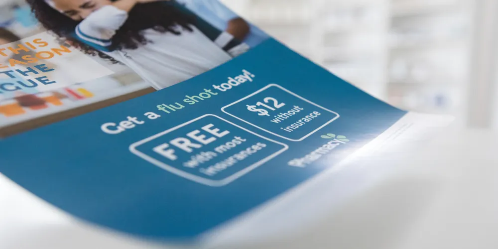
The BEST flyers are the ones that get people to TAKE ACTION. That's why it's important to know what you're advertising, how you want to be perceived, and how your audience will respond. With this knowledge in hand, you can create a flyer that will get people to open it and read the message within.
In this article, I'll share 10 quick tips for designing effective flyers that are sure to catch the attention of your ICA (ideal client avatar).
Know Your Target Audience
When you're designing flyers, it's important to know who your audience is and what they care about. The best way to do this is by asking questions like:
Who are my target customers?
What issues matter most in their lives?
How do they communicate with one another (i.e., through written or spoken words)?
What language would I use if I was talking directly with them about something that matters greatly to them?
This way you’ll KNOW where to position when designing your flyers.
Learn more about what are other interests that need to be included here… ( SOURCE )
Make the Message Clear
When it comes to flyers, your GOAL should be clear…is to get people to take action. Making sure that the message on your flyer is clear and simple.
Be specific:
Make sure that each point is clearly stated, so no one has any questions about what you're saying or why they should do something different from what they were doing before.
Use consistent language throughout your flyer:
Avoid using different words for "you" (e.g., "you" versus "we") because this will confuse customers and make them think twice about whether or not they should buy from you based on their own personal experience with similar businesses in their area (or elsewhere).
Keep it short and simple:
You don't need anything more than two sentences per page; if possible, try fewer than three. This way people can easily read through all of them without having any trouble keeping track of what's going on—and getting excited about buying from your business too.
Use High-Quality Visuals
One of the most important tips is to use high-quality visuals. This can be done in a number of ways, including using high-quality images and graphics.
High-quality infographics are also an excellent way to bring your message across effectively.
Using these types of media will help you communicate with your audience in a more impactful way than just text alone could do on its own.
Create a Bold, Attention-Grabbing Headline
A bold, attention-grabbing headline is an important element of your flyer design. It's what will catch the eye of potential customers and get them to remember your business name or service in order to come back again.
Use a clear and concise headline that is relevant to your audience
Use an interesting headline that says something about what you OFFER or how you can help them
Avoid using words like “FREE” or “money back guarantee” because it makes people think that there might be something wrong with what they're looking at (or even worse: it makes them think that the product/service isn't worth their time).
Add a Call-to-Action
A call-to-action is a command that encourages the reader to take a specific action. It's where you ask them to do something, such as subscribe, contact you or sign up for your newsletter.
It is a very CRUCIAL part of your flyer design.
So now…the best way to create effective calls-to-action is by writing them in plain language and being clear about what exactly it is that you want people to read about on your flyer (or whatever other pieces of printed material).
If you're promoting an event or offering free tickets for admission, try including instructions at the bottom of each page asking attendees which ticket type they'd like—as well as any other relevant details like parking pass numbers or directions from their home address.
Choose Fonts and Colours Wisely
Choosing the right fonts and colours for your flyers can make or break their overall appeal. Use easy-to-read fonts, choose colours that are not too bright, and avoid using too many colours.
If you're sending via email, and you want to GET NOTICED by your audience, then it's important to use a font that shows up well on a phone screen or computer screen—and not just any font will do.
Many people don't typically read from left to right but rather from the top down; this means that if you choose something like Times New Roman (the default font in Word), then it may not stand out as much as other options might be able for a flyer design—so try some other styles before settling on one.
Use Bullet Points & Infographics
Bullet points and infographics are great for breaking up text, BUT they can also be used to highlight important information.
This is especially true when you have a long piece of writing in which there's not much room left to separate different sections. By using bullet points, you're able to create an organised hierarchy of information and make it easier for readers to understand what each section is about.
Bullet points can also be used as a way of creating urgency or importance around certain topics: If I were going through this process myself (and I am), I might want my reader/listener/customer/etc., who may not be familiar with how things work here at Lime Design Studio, to feel like something really important has happened here today
because we've made a BIG CHANGE!
Think About Your Distribution Plan
When you are designing your flyers, consider the distribution plan.
Where and when will they be distributed?
Is it best to order them in advance or wait until just before the event begins?
How many copies are needed for each delivery location?
Where are they going to be placed?
If you have a large group of people coming to your event, then it is best to have enough flyers printed so that everyone has one. This way if someone loses theirs or drops it somewhere along their journey from home to the venue, there's still another copy available for them.
BUT if everyone attending knows where these flyers are located and are willing to grab one upon arrival at your place of business, then this becomes less important.
Include Contact Information
It is ALSO important to include contact information. It's the first thing people will see when they open your flyer, and if they don't know where else to go or how they can get in touch with you then there is no reason for them to keep reading.
You should always include a phone number on every piece of marketing material so that people can call if necessary: either personally or through an answering service (such as an automated system).
This also gives them another option other than emailing back at a later date when they have more time on their hands and aren't expecting any sort of response from someone else yet.
Make sure to include your…
Phone number
Email
Address
Remember to use tracking numbers when you can on all marketing materials. You can then measure your ROI.
Include Contact Information
Branding is important.
While it might sound like a very simple thing, BRANDING is actually one of the most important things when it comes to flyers design.
You see, branding helps you STAND OUT and build trust and credibility with your audience.
It can also help you become more memorable, create stronger emotional connections with your audience and ultimately make them want to buy from you over other companies in your market who don't have a strong identity or brand presence as yours does.
Remember…that the key to successful flyer design is balance. You need to make sure that your message is clear, but also engaging and memorable.
JOIN US on our Facebook Community Group (Lime’s Branding Lounge) where we give FREE resources and answer any questions regarding all things visual marketing and branding. Let’s create MASSIVE SUCCESS in your businesshere
.
The Short Version
A graphic design retainer gives your business consistent, professional design support without the overhead of hiring in-house or the friction of one-off projects. What's included, how it works and what it costs should all be transparent before you sign anything.
If you're thinking about whether a retainer would work for your business, we're happy to talk through what that would look like in practice.
Ready to elevate your brand? Let's chat.
Whether you need ongoing design support or a full brand refresh, we’ll take care of the visuals so you can focus on growing your business.
Contact us
Lime Design Studio -
Graphic Design & Branding
Unit 3, Knights Farm, Newton Road, Rushden, Northamptonshire NN10 0SX
Email: [email protected]
Lime Design Studio providing graphic design and branding in Rushden, Northampton, Milton Keynes, Leicester, Kettering and across the UK.
Copyright 2026 Lime Design Studio Ltd.
