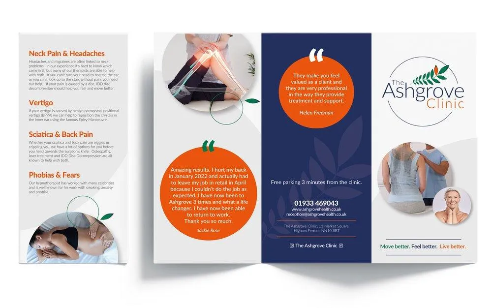
3 Flyer Design Myths Debunked

Your flyers are a great way to promote businesses, events, and other informational materials, but they can be TRICKY to design.
Many businesses make the MISTAKE of thinking that more colours, photos, or fonts will make their flyer look better, but this isn't always true. Keep reading for some tips on HOW so you can improve the design of your flyers without “breaking the bank”.
A flyer is any piece of paper or another medium that contains information about something. It is used by companies, organisations, and individuals in order to get the word out about their products or services. ALSO, it is used as a publicity tool for:
Musicians (concert tickets)
Athletes (sports themes)
Political (presidential campaigns)
You may have seen flyers at your local grocery store or pharmacy advertising things like coupons or special deals on certain products like diapers or toilet paper; these types of flyers are called “PUSH” ads because they push people toward buying something specific instead of just letting them know what it is they need.
If you want your flyer to STAND OUT in the crowd, following these tips can help:
1. Use a clean and simple design. Think about how you want people to feel when they see your flyer.
Is it informative?
Interesting?
Or just plain boring?
Make sure that when they open up your flyer, it feels like an inviting invitation for them to LEARN MORE about what's going on at the event or location where you're advertising.
2. Use a colour scheme that is easy to read. The same goes for fonts make sure everyone can easily read every word on your flyer without having any trouble deciphering what it says.
So, in this article, we debunk three of the most well-worn myths regarding flyer design today.
Myth #1. More Information, the Better
The first myth we debunked is that more information is better. This is a huge mistake because it can lead to your flyer being too wordy and uninteresting.
If you give too much information, people will lose interest in the product or service before they even reach the end of your flyer.
They may not even read it all the way through. You want them to be interested enough in what you're offering so that they'll keep reading until they get there, and then hopefully contact you for further information and advice.
Myth #2. More Colours, the Better
While it may seem like adding colour would make your flyer look more professional, this is actually not true.
In fact, when you have multiple colours on a single page or spread, it can actually create more headaches for the reader.
This is because there are fewer places to focus your eyes and read all of the text without losing track. In order to keep them from getting lost in too much information at once (and causing them to skim), designers often choose not to use too many colours at once… but then again they also don't want their audience to feel overwhelmed by an abundance of options either.
It doesn't matter how many different shades and colours you use as long as they are all complementary (or contrastive) ones; HOWEVER, if one shade dominates over another then it will look out of place no matter what other designs surround it.
Myth #3. People Spend 1 Minute on Your Flyer at Most
A LOT of people think that if you spend thousands on your flyer, they'll be able to read it and remember. But this is a FALLACY!
People are BUSY, they're bombarded with information every day, and their attention spans are SHORT…you can't expect them to remember every detail about your business or even what you do.
The sad fact is that most people don't want to be SOLD to by any means necessary (especially when they're trying to find something specific).
They want VALUE for their time and money, so make sure that whatever message you send out through your marketing materials makes sense within the context of what's being sold (or promoted).
“A Design Can MAKE or BREAK Your Flyer.”
Design plays a BIG role in how people perceive your flyer. The right design can make or break your flyer, so it's important not to skimp on the process or use shortcuts that might compromise the QUALITY of your final product.
If you want people to read through all of your content before they decide whether or not they'll buy from you, then include as RELEVANT information as possible, and don't be afraid of colour.
A well-designed flyer will STAND OUT against its competitors because of its bright colours and contrasting patterns.
Don't forget about font choice either; while some fonts are easier than others (like Times New Roman), using something bolder may help draw attention away from certain parts of the text that need extra emphasis (like a phone number).
Well, the bottom line is that your flyer is not just about YOU, it’s about THEM.
And if you want a better chance of getting their attention, it’s time to think outside the box and work harder on your design.
If you want a step-by-step process on how to effectively create your flyers?
JOIN US on our Facebook Community Group (Lime’s Branding Lounge) where we give FREE resources and answer any questions regarding all things visual marketing and branding. Let’s create MASSIVE SUCCESS in your business >> here inside <<.
Ready to elevate your brand? Let's chat.
Whether you need ongoing design support or a full brand refresh, we’ll take care of the visuals so you can focus on growing your business.
Contact us
Lime Design Studio -
Graphic Design & Branding
Unit 3, Knights Farm, Newton Road, Rushden, Northamptonshire NN10 0SX
Email: [email protected]
Lime Design Studio providing graphic design and branding in Rushden, Northampton, Milton Keynes, Leicester, Kettering and across the UK.
Copyright 2026 Lime Design Studio Ltd.
